What's new

New in the Theme Builder

New features and improvements, newest first. Each entry links to the feature or a guide on using it.
New

Share a theme with a link

Send anyone your exact theme as a single URL. There's nothing to export and no account to make.
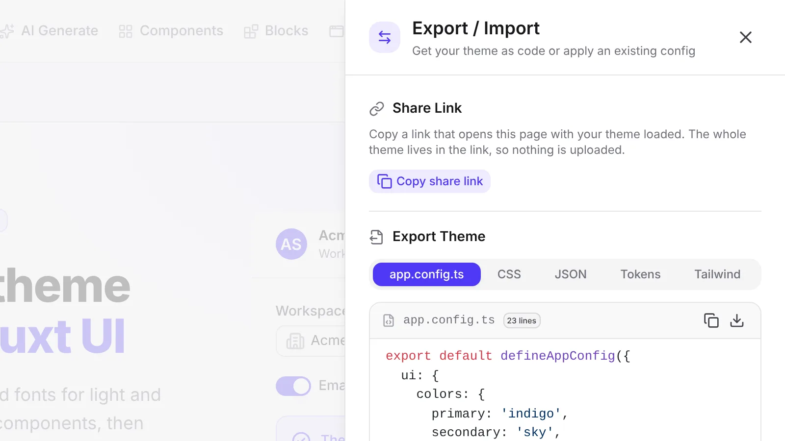
The export panel with the Copy share link button next to the theme code

Click Copy share link in the sidebar toolbar, the export panel, or the command palette. Anyone who opens the link sees your exact theme: colors, shades, neutral, radius, font, and every light and dark override.

The whole theme fits in the URL, so nothing is stored on a server. If a link gets cut off or edited, your current theme stays as it was and a warning explains why. Opening a shared theme can be undone like any other change.
New

Start from your logo

Drop in a logo and get a matching primary, secondary, and neutral in one step.
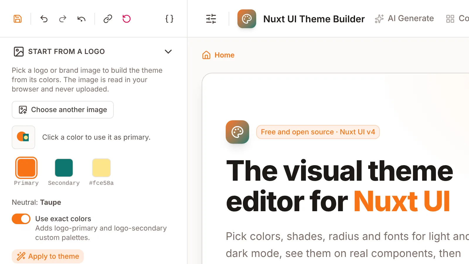
The Start From a Logo section suggesting colors picked out of an uploaded logo

Open Start From a Logo in the sidebar and pick a PNG, JPG, WebP, GIF, or SVG. The builder finds the logo's main colors and suggests a primary, a secondary, and a neutral that suits them.

You can swap which color leads, and choose between your logo's exact colors (added as custom palettes) or the closest Tailwind palettes. The image is read in your browser and never uploaded, and applying the colors is a single undo step.

New

Export design tokens and a Tailwind theme

Two new export formats for design tools and for projects that use Tailwind CSS without Nuxt UI.
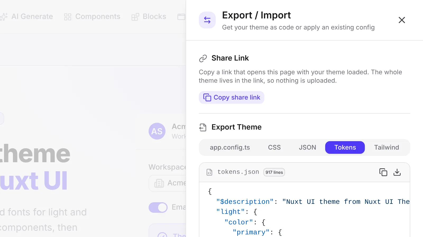
The export panel showing the Tokens tab with a tokens.json file

The export panel has two more tabs next to app.config.ts, CSS, and JSON.

  • Tokens gives you a tokens.json file in the W3C Design Tokens format, with a light and a dark group. It holds each color's full 50 to 950 scale, the neutral scale, text, background, and border tokens, the radius scale, and the font. It imports into Tokens Studio as two token sets, so designers can work from the same theme.
  • Tailwind gives you a tailwind.css theme for projects that use Tailwind CSS v4 without Nuxt UI. It uses the same utility names Nuxt UI does, like bg-primary, text-muted, bg-elevated, and rounded-md, with a dark mode block included.

Both formats use the exact colors Nuxt UI renders for your theme, including shade shifts and dark mode overrides.

New

Contrast Check in the sidebar

See which text and button colors fall below WCAG AA, and fix each one with a click.
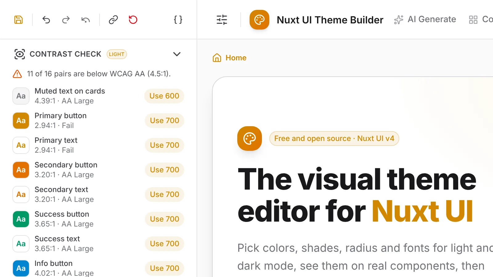
The Contrast Check section listing color pairs with their contrast ratios

The new Contrast Check section tests the color pairs Nuxt UI actually renders in the mode you're editing. That covers body and muted text on the page and on cards, the label on each solid button, and each semantic color used as text.

Any pair below WCAG AA (4.5:1) shows its ratio and the nearest shade that passes, and one click applies it. The check follows your shade shifts and dark mode overrides, so it measures the theme you'll actually ship.

New

Component defaults

Choose the color, variant, and size that buttons, form fields, badges, and cards use out of the box.
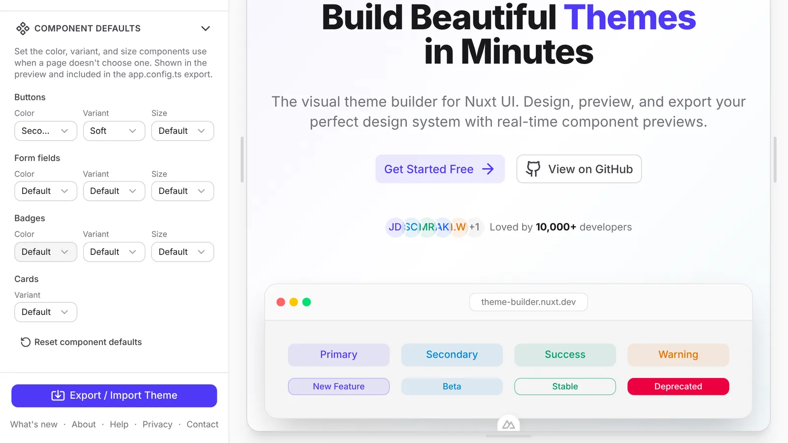
The Component Defaults section set to soft secondary buttons, next to the landing template using them

Open Component Defaults in the sidebar to set what components use when your code doesn't say. Buttons, badges, and form fields (inputs, textareas, selects, and number inputs) take a color, variant, and size, and cards take a variant.

Every preview page picks up the change right away, and the app.config.ts export writes it out as Nuxt UI defaultVariants. A design system built on ghost buttons or small inputs now ships with the theme instead of needing a find-and-replace afterwards.

Improved

Preview and save themes from the gallery

Try any built-in theme on the page you're on, or keep it in My Themes, straight from its card.
Theme gallery cards with Preview theme and Save theme buttons

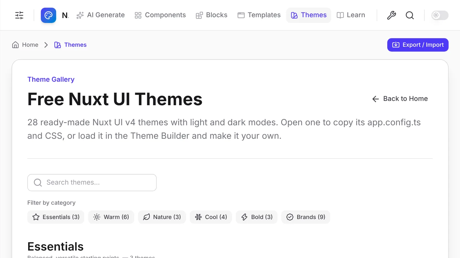
Every card in the theme gallery now has two buttons. Preview theme applies the theme right where you are, so you can compare a few without losing your place. Save theme adds it to My Themes without touching the theme you're editing, and the button changes to Saved once it's there.

New

Theme gallery

A page for every built-in theme, with light and dark previews and the code to copy.
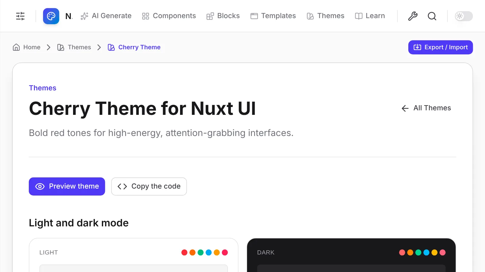
A theme gallery page showing a theme's light and dark previews

The new theme gallery collects every built-in theme in one place. Each theme has its own page with a light and dark preview, its app.config.ts and CSS ready to copy, and links to related themes and guides.

Search by name, or narrow the list with the category chips, which work the same way they do on the Components, Blocks, Templates, and Learn pages.

Fixed

The Nuxt UI preset matches the real thing

The Nuxt UI preset now uses the same green that Nuxt UI's docs and starter templates ship.

The Nuxt UI preset used Tailwind's green, which is close to Nuxt's brand green but not the same. It now uses the Nuxt green (#00DC82) for primary and success. Dark mode was also rendering every semantic color one step too light, and now matches what a fresh Nuxt UI project looks like.

New

Five new Learn articles

Quick tips and guides for brand colors, border radius, restyling one component, migrating to v4, and comparing Nuxt UI with shadcn-vue.
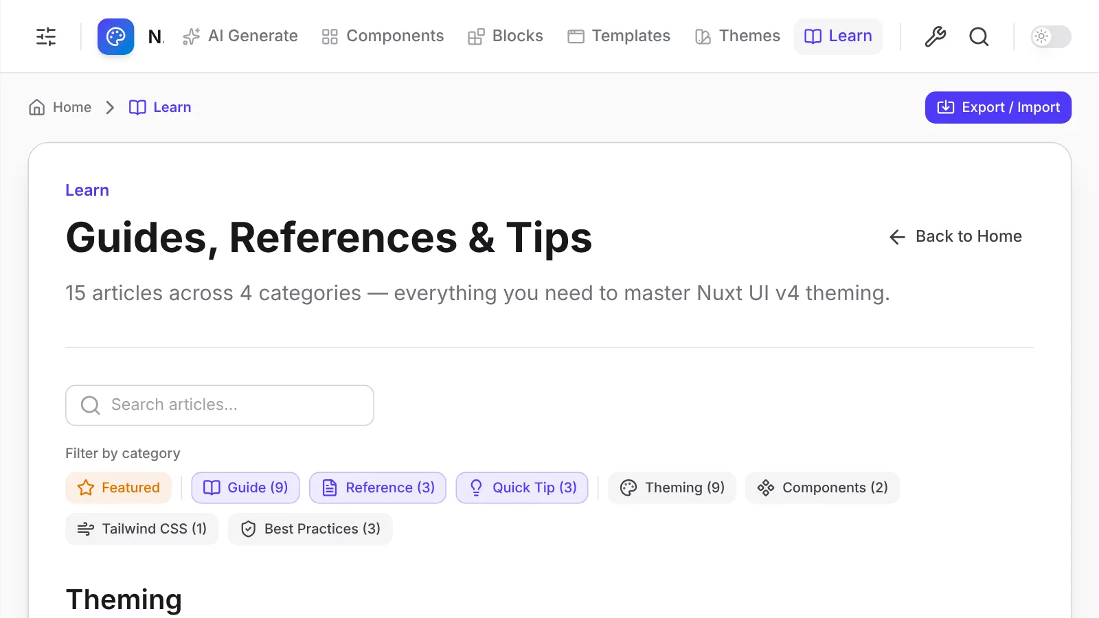
The Learning Hub listing guides, references, and quick tips

The Learning Hub gained five articles:

Existing articles now link to the tools, components, templates, and themes they describe.

Improved

A homepage that shows your theme

The homepage now previews your current theme on real components, in light and dark.
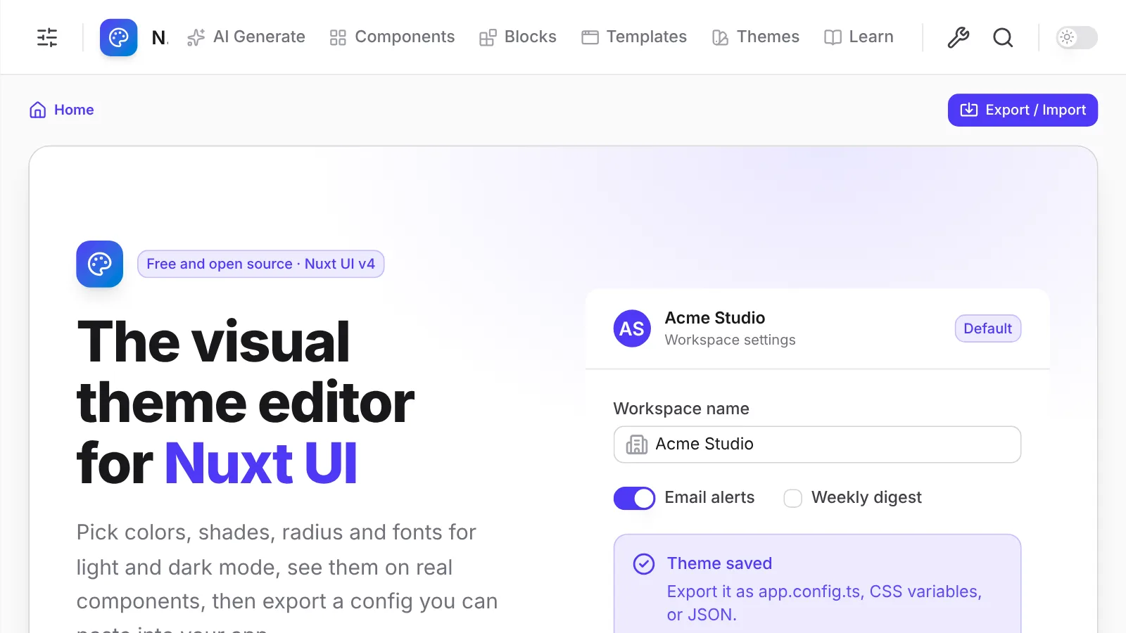
The homepage hero showing real Nuxt UI components in the current theme

The homepage now leads with a live preview: real Nuxt UI components and light and dark swatches, all in the theme you're editing. Change a color in the sidebar and the page follows.

Example prompts load a matching theme in one click, and the app.config.ts at the bottom of the page is the actual export for your current theme.

New

Custom palettes from one brand color

Enter a hex value and get a full 50 to 950 palette you can use for any color role.
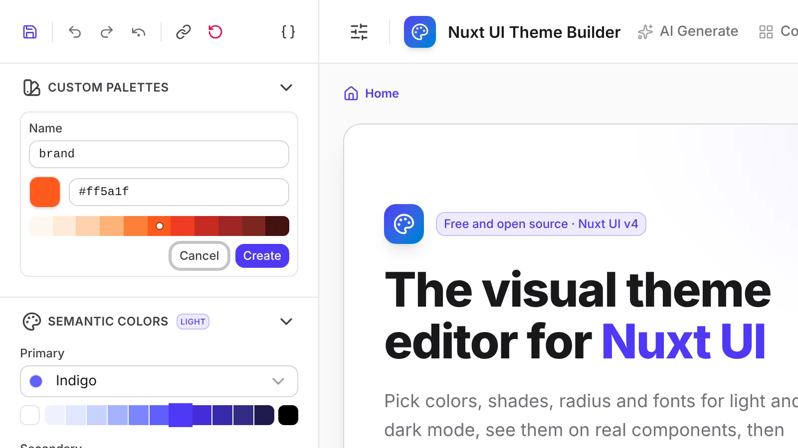
The Custom Palettes section with a generated palette from a brand color

Tailwind's palettes are a great start, but your brand color is rarely one of them. Add a custom palette with one color, and the builder generates a full 50 to 950 scale that follows the curve of the closest Tailwind palette, with your exact color on the matching shade.

Assign it to primary or any other role, and it previews live, saves with your theme, and exports as a @theme static block alongside your app.config.ts. A theme can hold up to six custom palettes.

New

Four new neutrals

Taupe, Mauve, Mist, and Olive join the neutral palettes.

Neutrals set the tone of a whole interface: backgrounds, borders, and most of the text. Tailwind CSS added four warmer and cooler grays, Taupe, Mauve, Mist, and Olive, and you can now pick any of them as your theme's neutral, separately for light and dark mode.

New

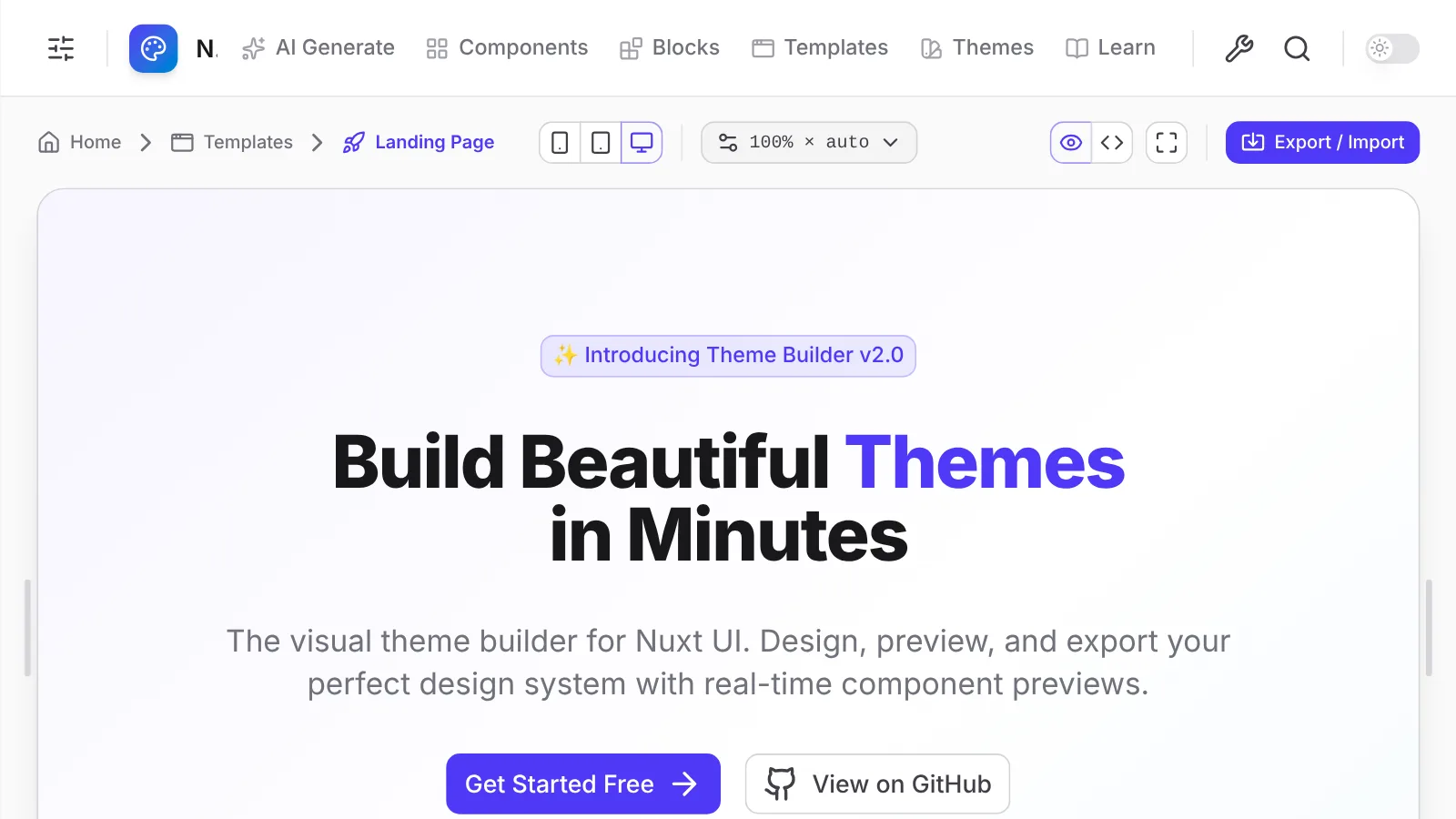
Nuxt UI Theme Builder 1.0

A visual editor for Nuxt UI v4 themes, with live previews and code you can paste straight into your project.
The theme builder editor next to a landing page template preview

The Theme Builder launched with everything you need to design a Nuxt UI v4 theme without guessing:

  • Semantic colors, shades, neutral, radius, and font, set separately for light and dark mode.
  • Live previews across components, blocks, and full page templates.
  • Built-in presets to start from, plus undo and redo and saved themes.
  • AI theme generation using your own API key.
  • Export as app.config.ts, CSS, or JSON.
  • Color tools and a Learning Hub with guides on theming Nuxt UI.